Orixe Redesign
The Problem
The goal was to update the auditing module in the Orixe solution so that it would look modern and more importantly make it user friendly.
Responsibilities
The team collaborated on everything.
Team
Julie Habbestad
Time span
4 weeks
About Orixe
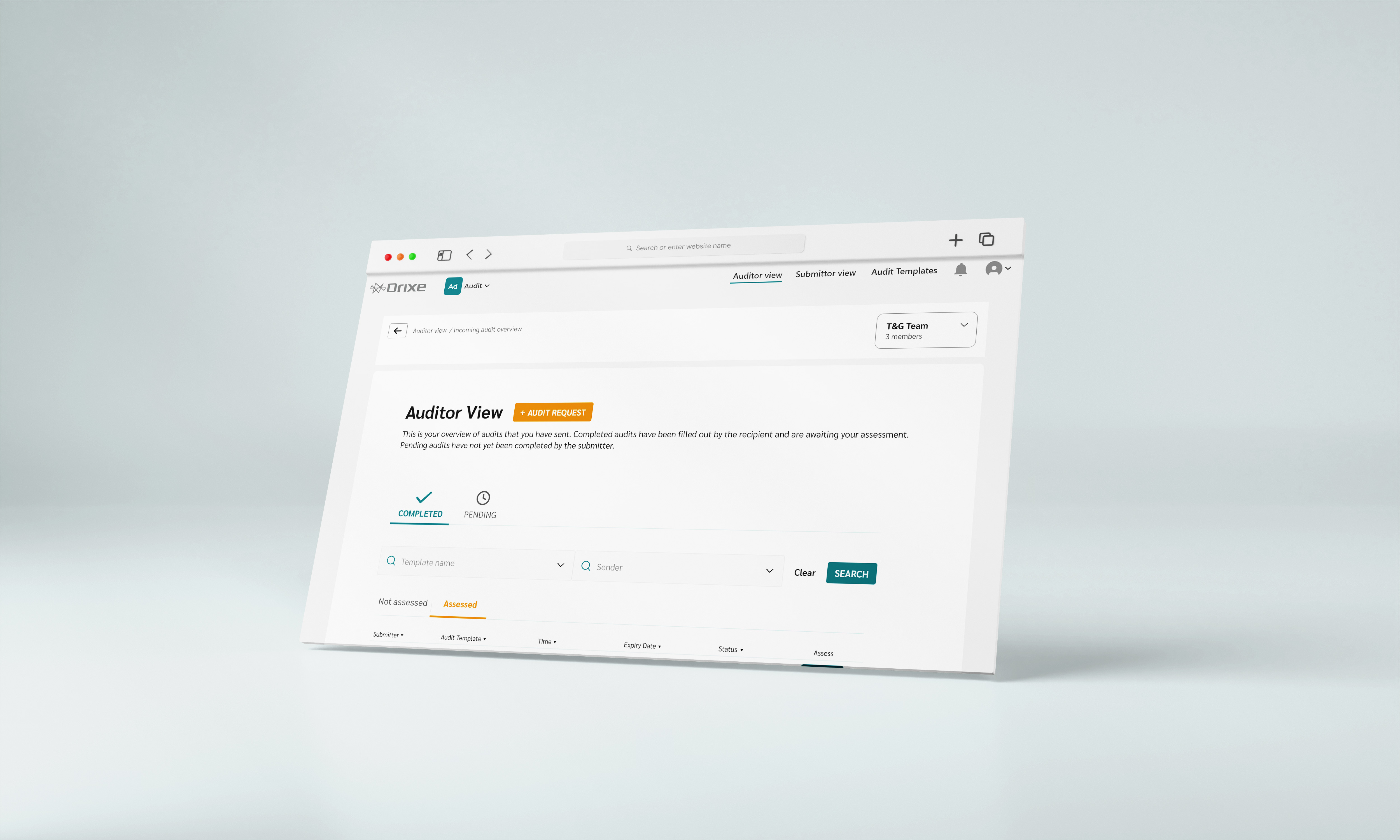
Orixe is a software solution with modules focusing on transparancy in the supply chain. The main foucs of this redesign was the Audit module. In this module the user can audit suppliers inside the platform with predefined templates together with their team. Everything is organized and easy to find in contrast to email based auditing.
UX Review
The look of the website was outdated, and there was a lot of design flaws and errors that hindered the users from doing their tasks.
Ux Review
Main Problems
Insight 1
Too much information
Insight 2
Lacking hierarchy
Insight 3
Confusing flows
Insight 4
Unclear naming
The Process
I used design thinking to guide me through this process.
Understanding the Problem
In order to get a better idea of the problems needing to be solved I did the following:
Interviews and testing with existing users
Understanding business goals
Insights after interviews and usability testing with users
- Unclear flows of action
- Too short pop-up notifications
- Lacking feedback messages
- The users were not aware of being apart of a team
Insights after meeting about business goals
- More modern and fresh design
- Want to use less time on customer support and bug fixes
- Process should be self explanatory
- Happy users that will recommend the software to others
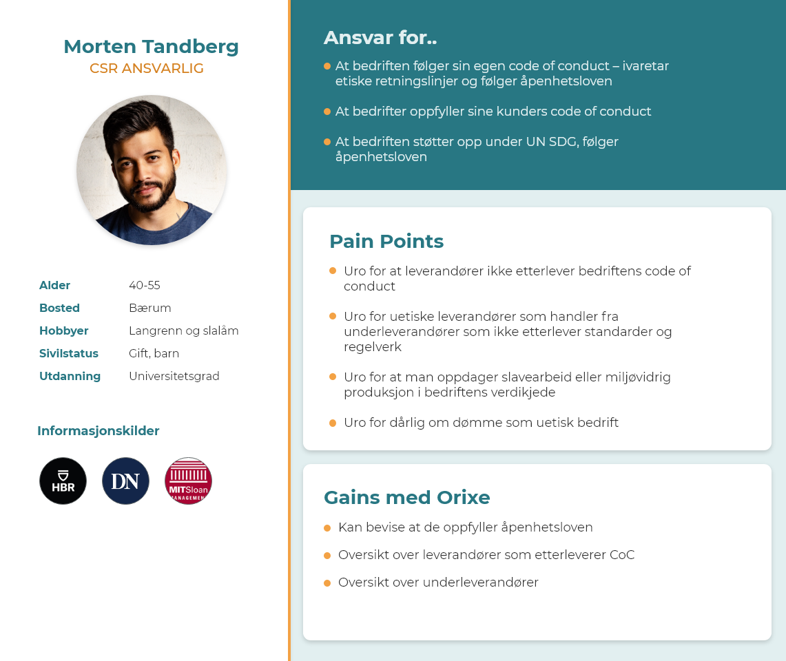
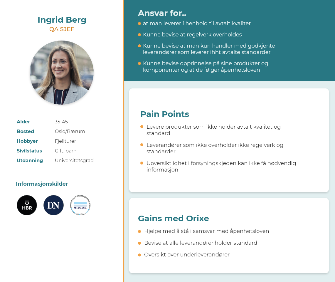
Personas
I made sure to keep the users in mind when working on the redesign.
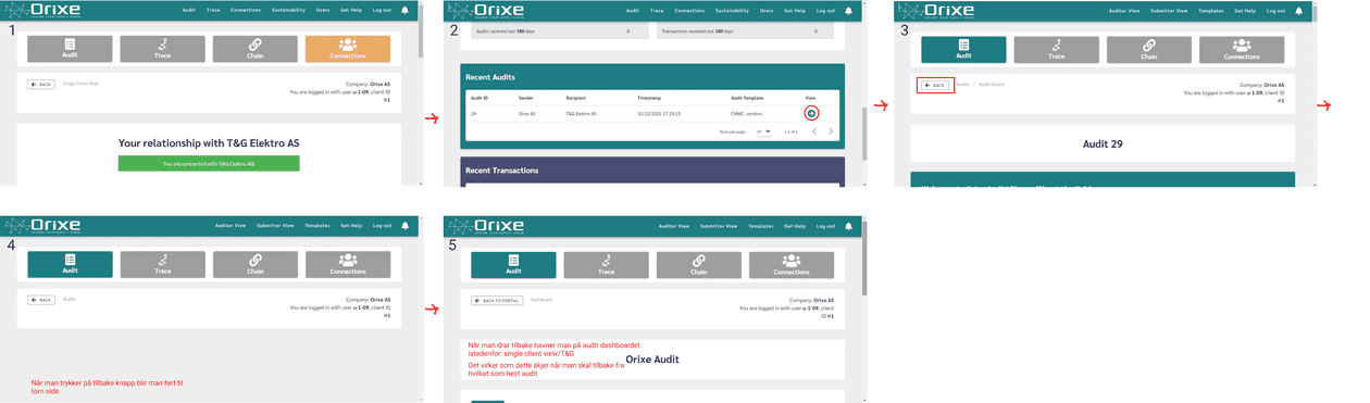
Competitive Analysis
Before we started developing the idea further I did a competitive analysis of three different related apps.
Redesign
I focused on removing excess information and steps. Making more calls to action was also important in addition to hierarchy. A lot of information was confusing because there was not proper hierarchy of information and too much visual clutter.
Usability Testing
The next step was to test the updated design and gain feedback on the design.
Tasks
Send an audit
Invite a supplier
Fill out sustainability survey
Answer an audit
Make a template
Explore and tell me your thoughts
Insights
Insight 1
There were still some confusing names needing to be fixed.
Insight 2
The results were very positive overall and there were significant improvements from the first test.
Takeaways
The redesign has been well received by our users. However there are still improvements to be made and more features to be designed to create an even better platform.